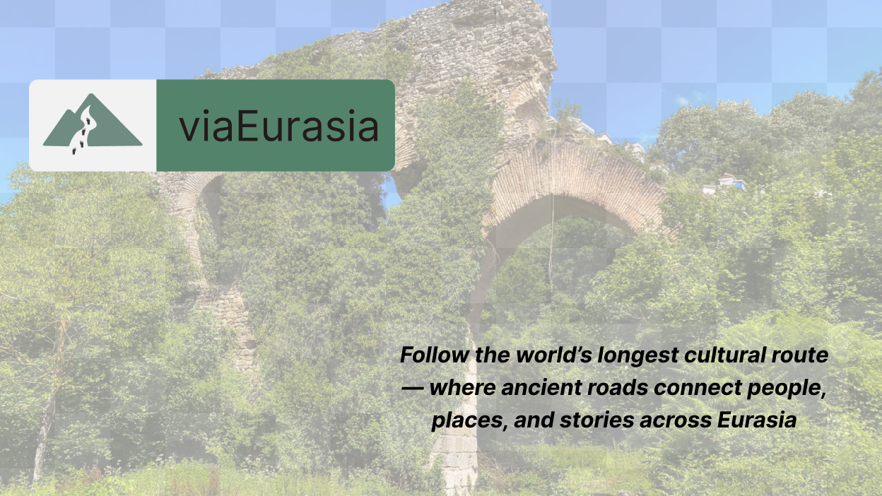
viaEurasia
Objective
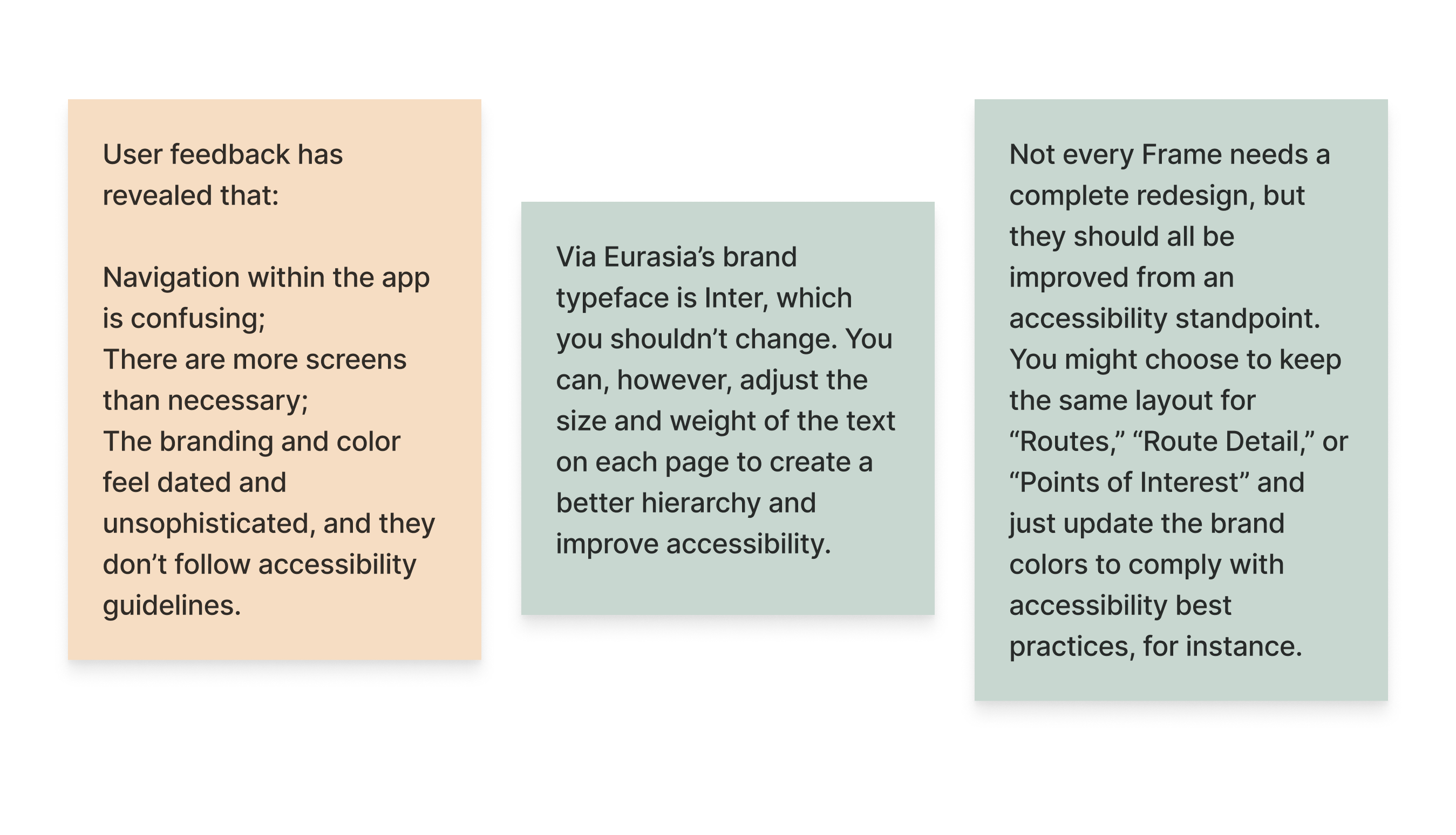
As part of my UX/UI course, I undertook the redesign of the Via Eurasia website to modernize its look and improve usability. The redesign focused on improving clarity, usability, and visual hierarchy. The project aimed to simplify navigation for users searching flights, accommodations, and activities, while modernizing the interface with a cleaner layout and more intuitive interactions. Conducted as a short design sprint, this project demonstrates how even small adjustments to structure and style can create a more engaging and user-friendly travel experience.
Redesign Requirements
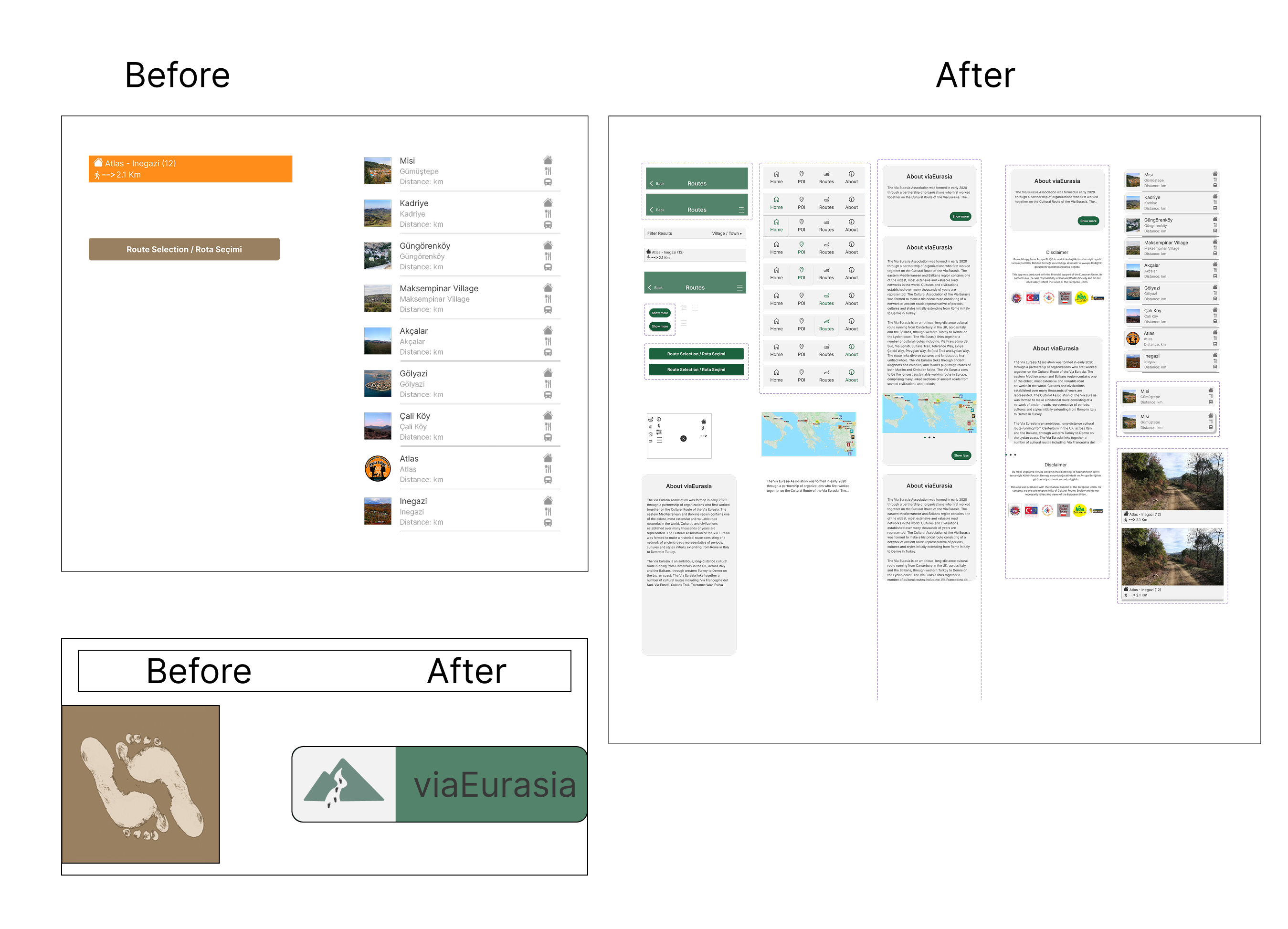
The following slides show direct before-and-after comparisons, highlighting how the interface was modernized with a cleaner layout, simplified flows, and a more user-friendly look and feel.
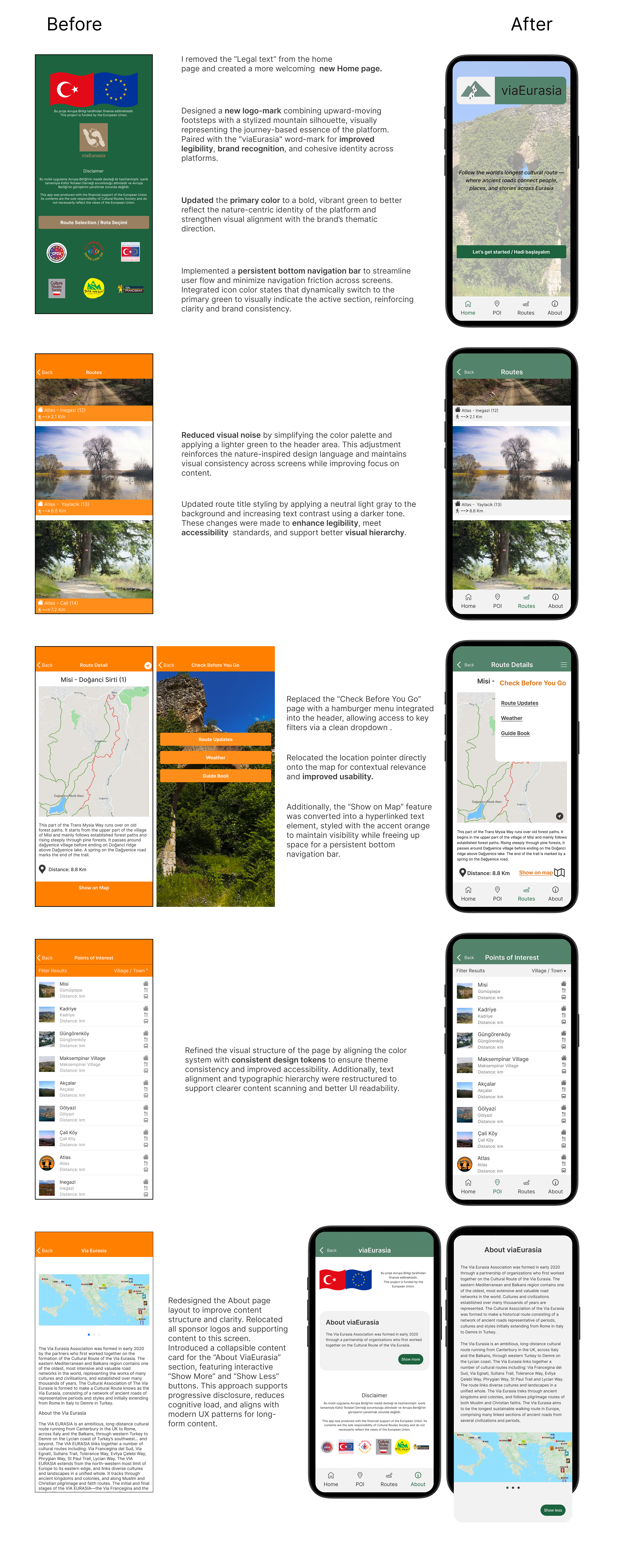
viaEurasia: Before and After Screens
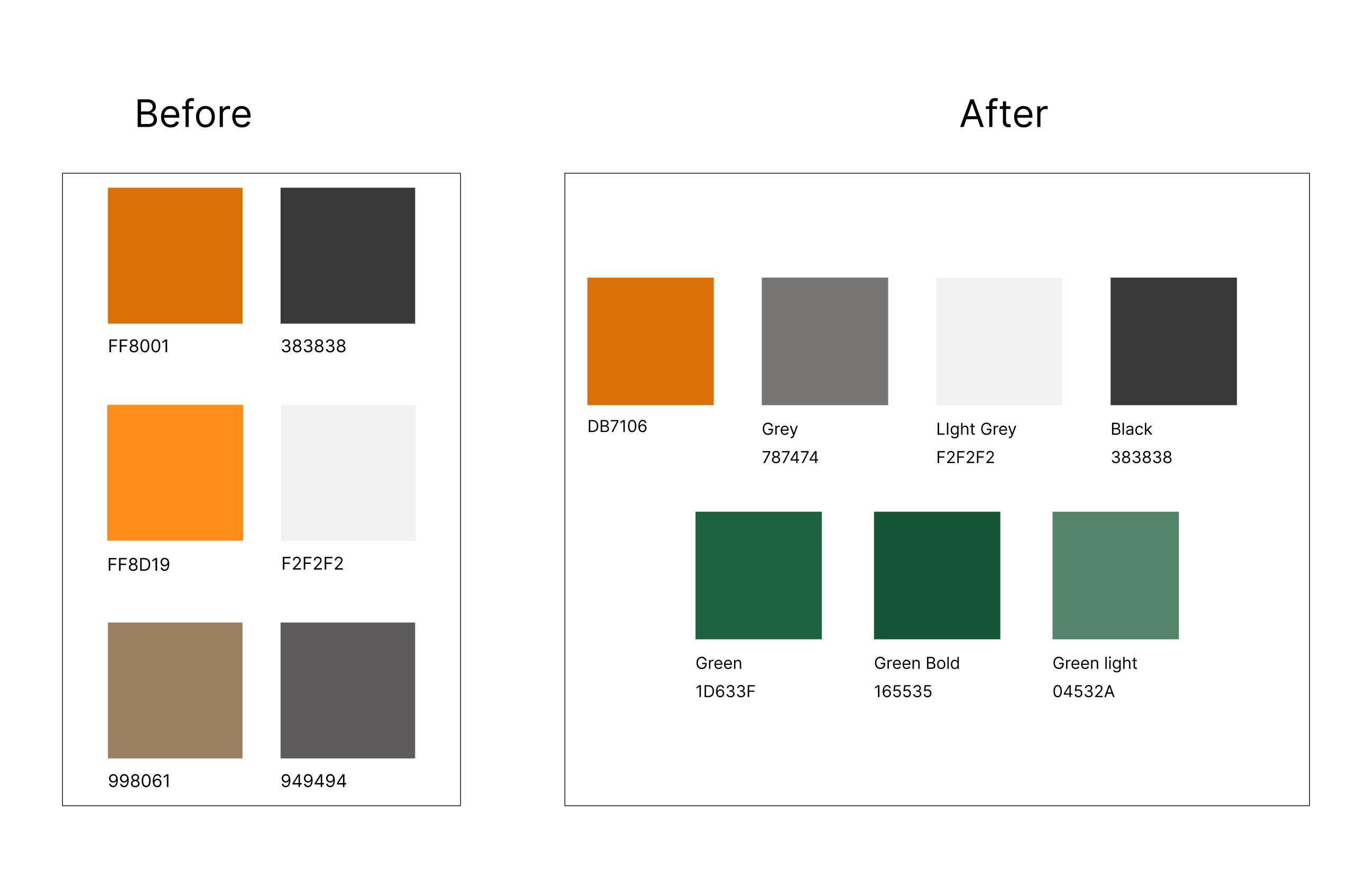
Color: Before and After
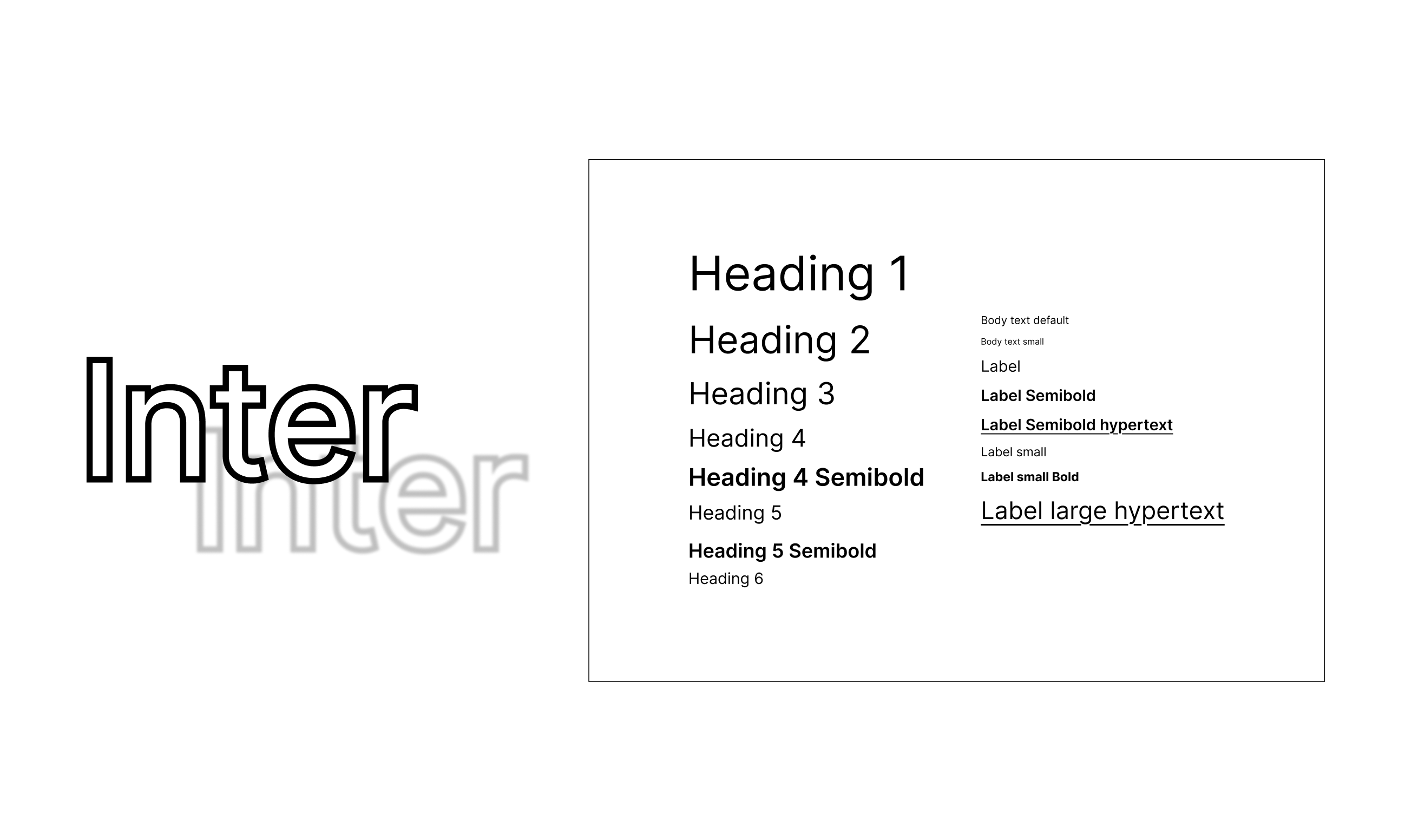
Typography and Text
Components Before and After
Video animation
Check out this short video animation to see how it all works.
Thanks for stopping by!
If you have any questions or would like to connect, please reach out via the contact form below.