SaveUp
Project Overview
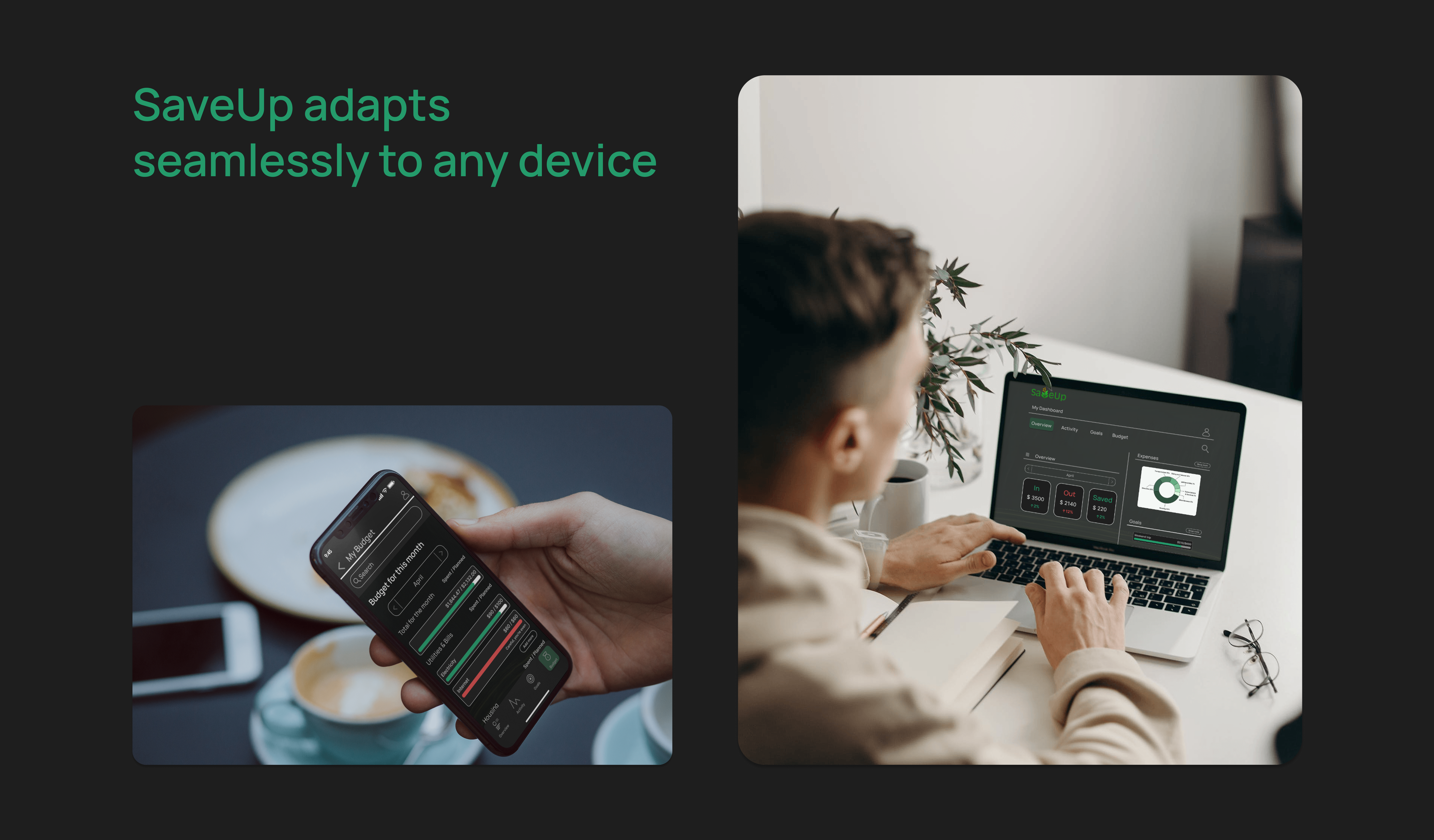
SaveUp is a responsive financial app built to help users save money quickly and intentionally — for trips, weddings, major purchases, or debt reduction. It offers a clear dashboard, smart budgeting features, and personalized savings plans, all accessible across devices.
Tools Used
Pen and Paper
Figma

Microsoft Office
My Role
I led the end-to-end product design for SaveUp — from:
- user research
- flow mapping
- wireframing
- visual design
- interactive prototyping
I focused on creating a user-centered experience that makes saving money feel easy, approachable, and rewarding.
Problem
Many people struggle to save money effectively because:
- Users often feel overwhelmed by managing personal finances.
- Saving toward specific goals within a timeline is a common challenge.
- They need more than functionality—they need encouragement.
- A frictionless experience is key to building saving habits.
- Translating spending into achievable, motivating goals is essential.
Solution
Create a cross-platform savings app designed to simplify money
management and keep users motivated.
SaveUp helps users:
- Track income and expenses in real time.
- Visualize their spending by category.
- Set goals with deadlines and stay on track.
- Access their savings plan seamlessly on mobile or desktop.
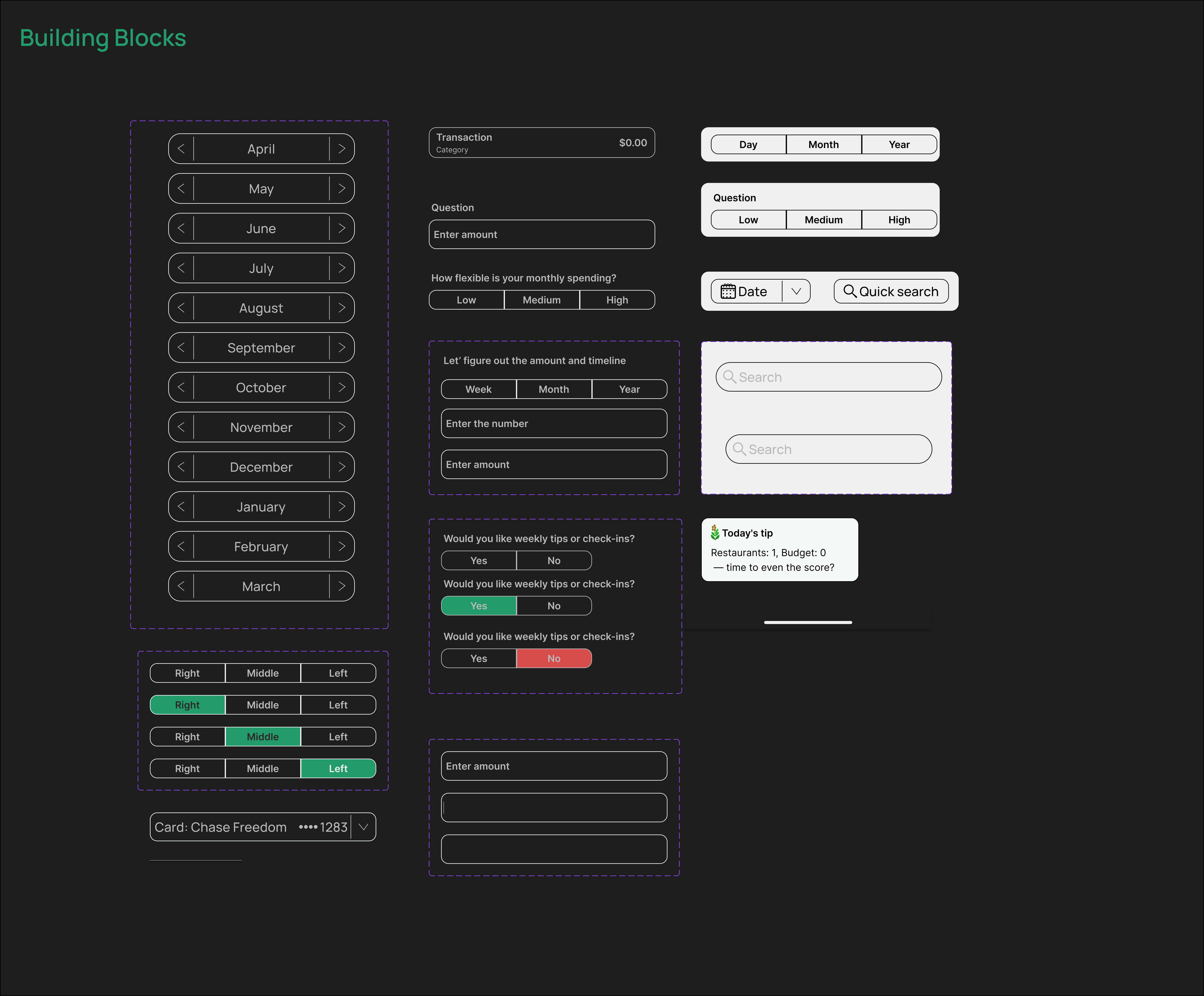
Wireframing
- Focused on user goals: saving, tracking, and staying motivated.
- Clean, minimal layouts designed for clarity and ease of use.
- Early wireframes mapped key flows like budgeting and goal creation.
- Data visualized in a friendly, non-intimidating way.
- Iterative refinements driven by user feedback across devices.
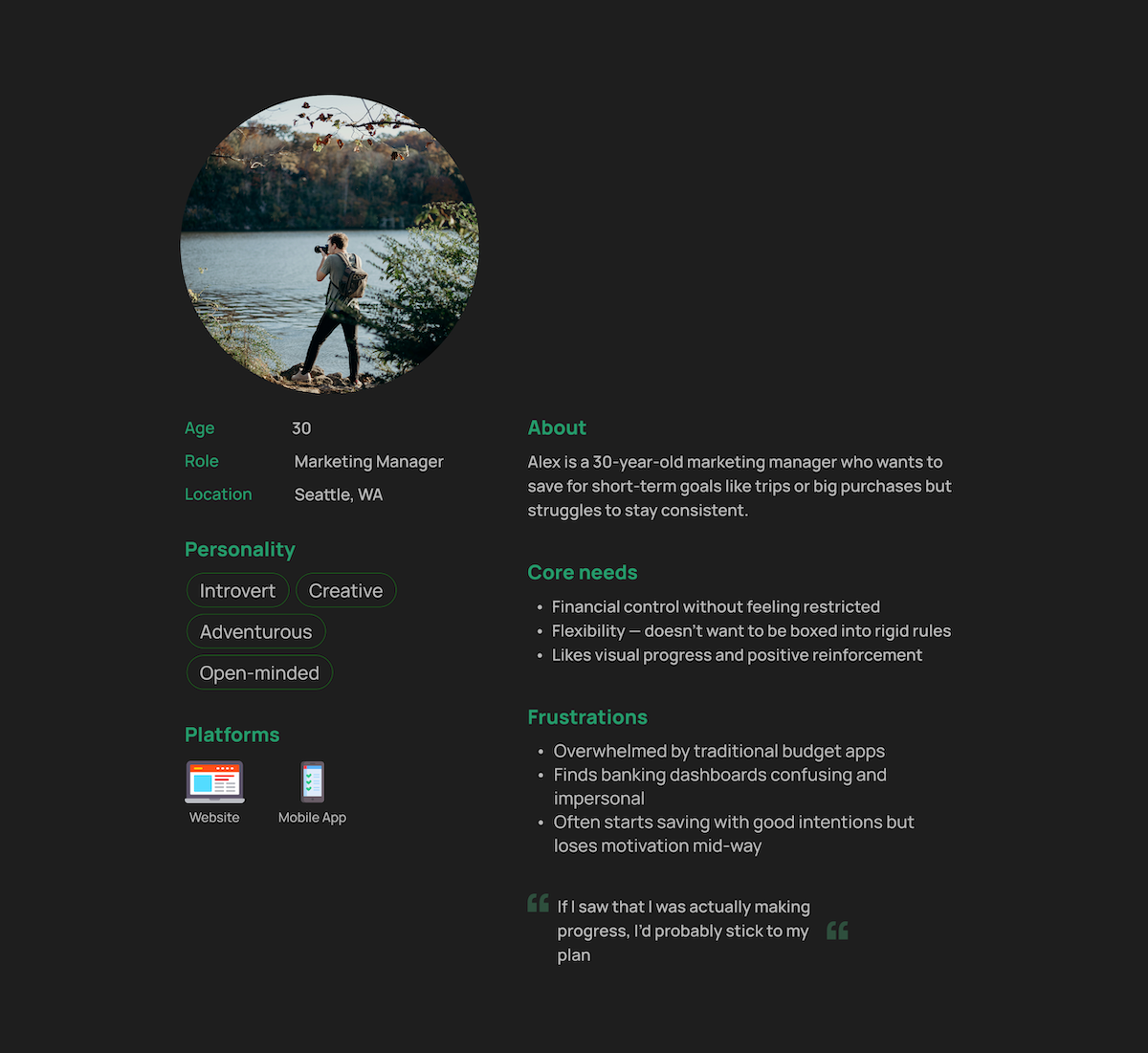
User
User Persona
Tech-savvy professionals (25–45) saving for meaningful goals—seeking a smart, intuitive tool that fits their busy lives. They want visual, motivating insights without the hassle of spreadsheets—anytime, on any device.
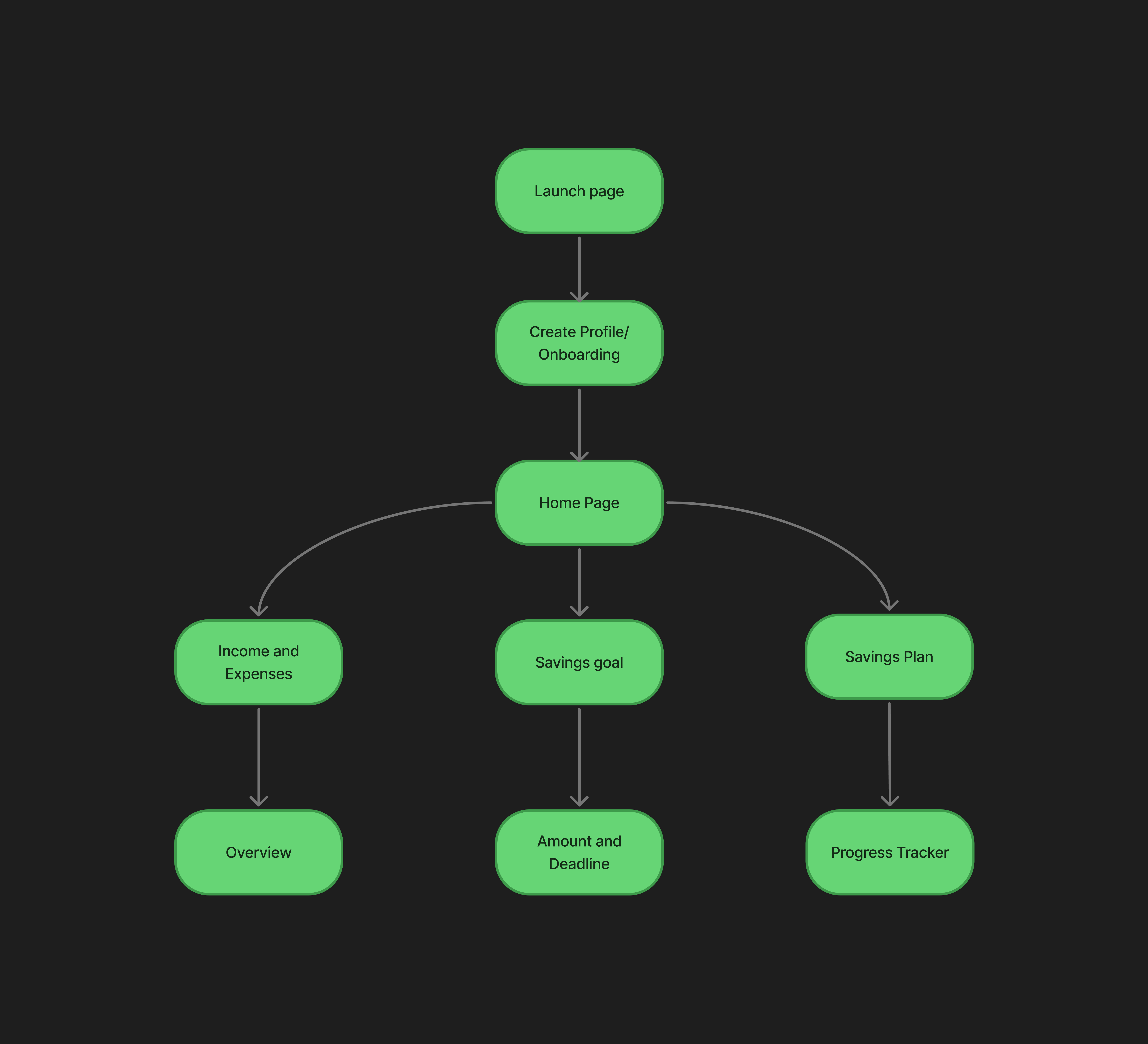
User Flow Diagram
- I need to be able to input information on the money I am receiving and spending (and on what), so that I can see an overview of my finances.
- I want to see a dashboard of my finances clearly and visually, so that I can see how much I am spending on what at a glance.
- I need to be able to tell the tool what my savings goal is and how long I have to reach it, so that I can save accordingly.
- I want to receive a personalized savings plan, so that I can save enough money to reach my goal in time.
- I need to set goals with deadlines and stay on track.
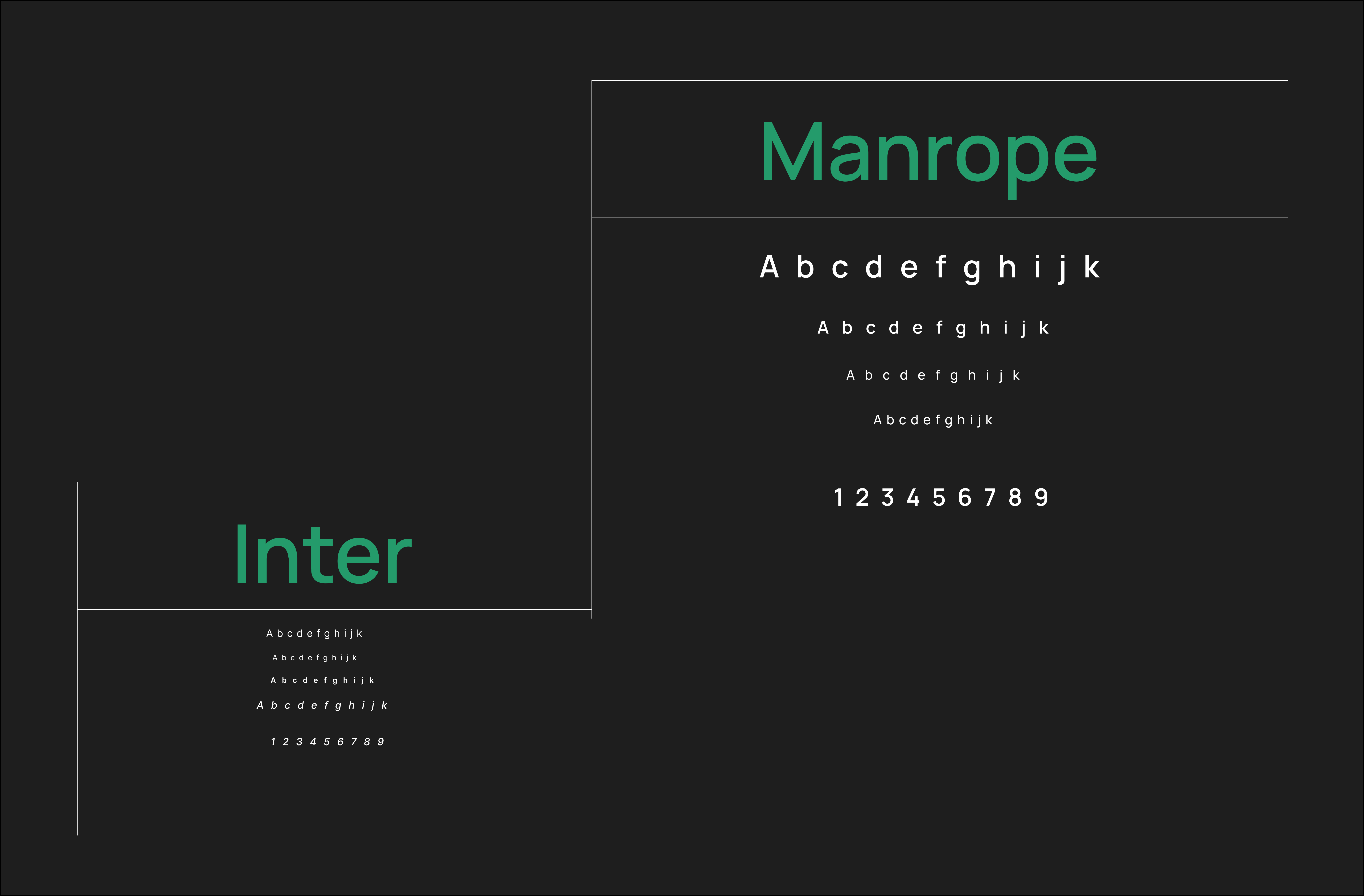
Styleguide
Color

Typography
Logo
The SaveUp logo is designed for flexibility and clarity across contexts. It works effectively on both light and dark backgrounds. On colored or photographic backgrounds, it may appear in solid white or its original green/gold palette for optimal contrast.In tight spaces or smaller sizes, the tree icon can be used independently—with or without a background shape such as a circle, square, or badge—for brand consistency at any scale.
Design Evolution
Low-Fidelity Wireframes
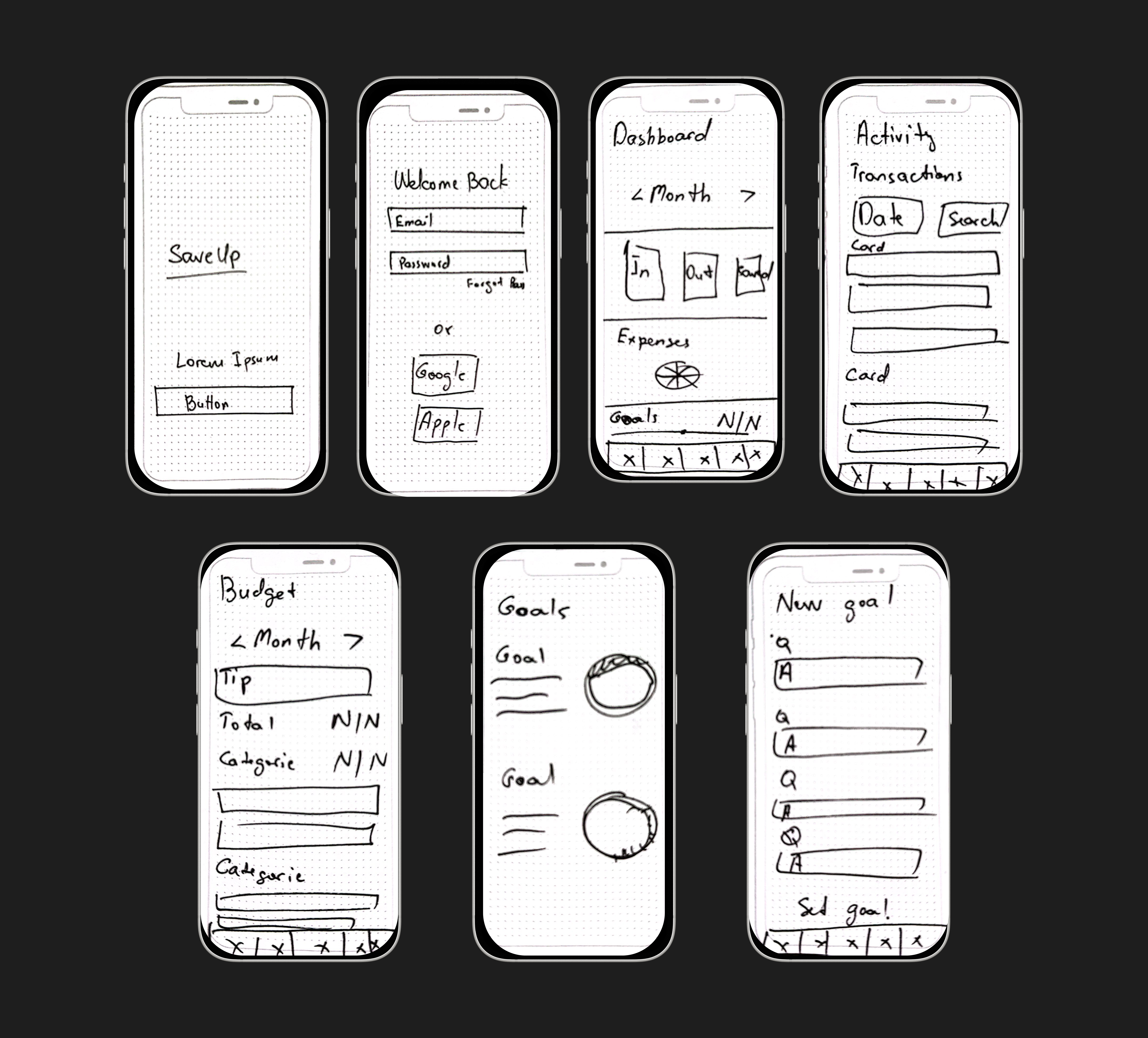
Mid-Fidelity Wireframes
Testing
User testing scenario:
As someone who’s trying to save money for a specific goal (like a trip, a big purchase, or paying off debt) you want a simple tool that helps you track your spending, manage your budget, and see your progress toward that goal. Explore the app and tell us how the experience feels.
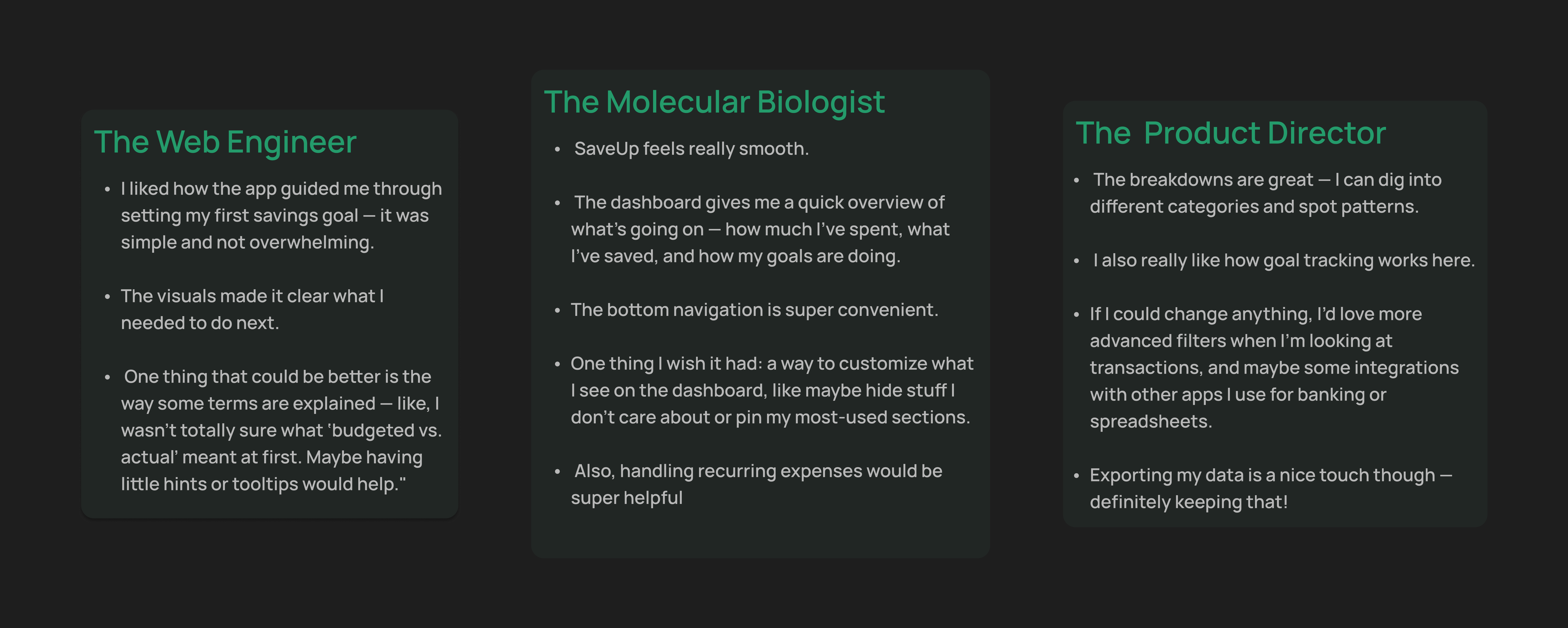
Iterations included
- Adding a drop-down/collapse option on the Transactions page for a more dynamic and user-friendly experience.
- Adding hamburger menu to the Dashboard page to allow users to customize their dashboard view.
- Refining the visual hierarchy of key information
- Changing the word “budgeted” to “planned” for better clarity on the Budget page. Also a tip/warning note was added under the categories that are either even with or going over the planned budget.
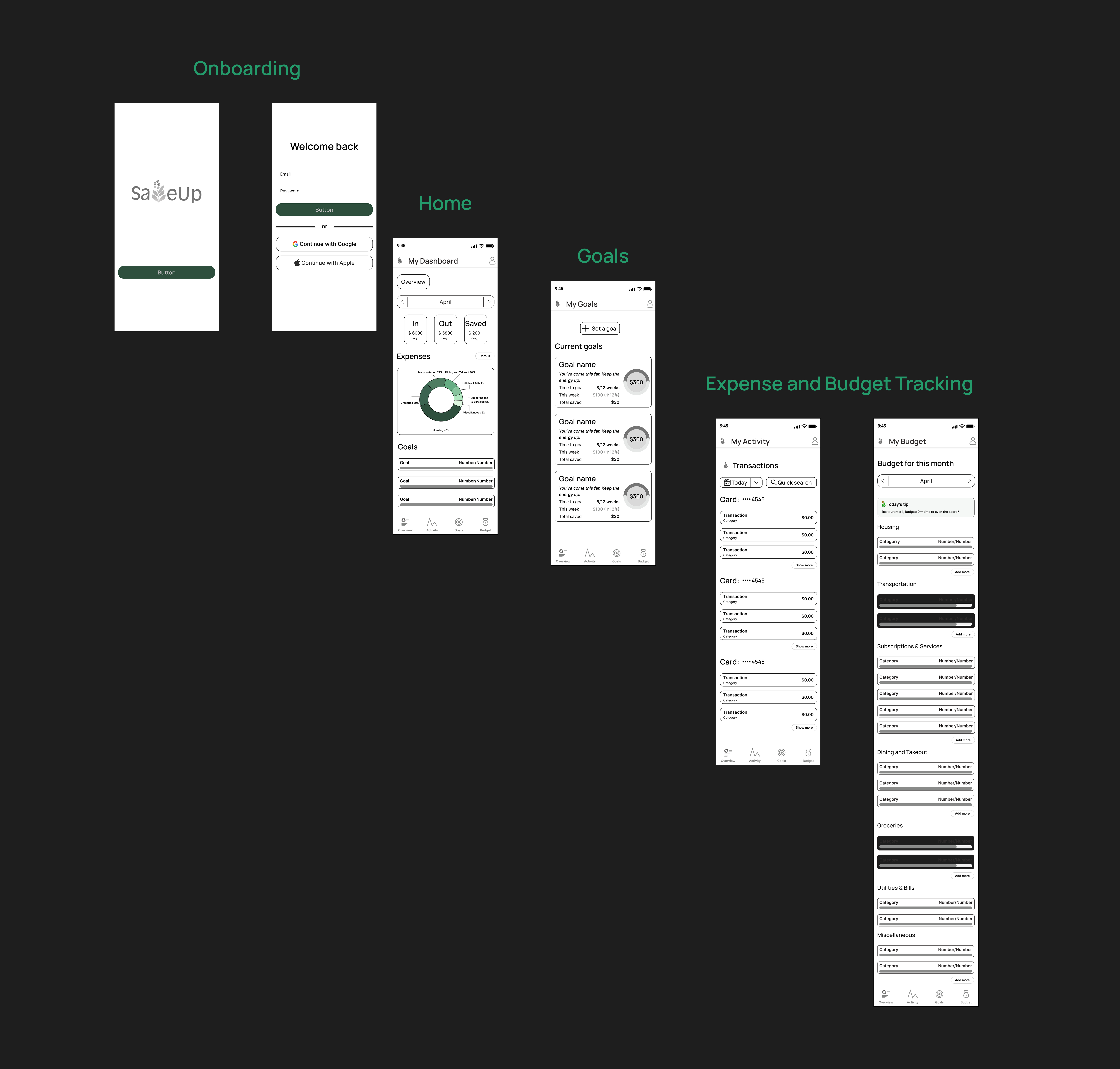
SaveUp Screens
Reflections
- Designing SaveUp emphasized the importance of balancing simplicity with functionality.
- User feedback confirmed that clarity, motivation, and flexibility are key to encouraging short-term savings behavior
- The visual design and feature set successfully support users who want smart guidance without complexity
Next Steps
- Refine the budgeting flow based on user feedback (e.g., enhanced filters, clearer category management)
- Explore integrations with banks and spreadsheet tools for seamless data tracking
- Improve onboarding to personalize the savings plan faster using AI.
- Scale the desktop web version and conduct additional testing to ensure consistent responsiveness across platforms.
Thanks for stopping by!
If you have any questions or would like to connect, please reach out via the contact form below.