MuseMatch
Project Overview
MuseMatch is a native Android and iOS app designed to connect creatives with collaborators, mentors, and sponsors. It transforms networking into meaningful relationships, helping artists turn inspiration into projects and conversations into momentum.
Tools Used
Pen and Paper
Figma

Balsamiq
My Role
I led the end-to-end product design for MuseMatch — from
- concept to user research
- flow mapping to wireframes
- visual design
- interactive prototyping
I focused on creating a user-centered experience that blends artistic personality with intuitive functionality.
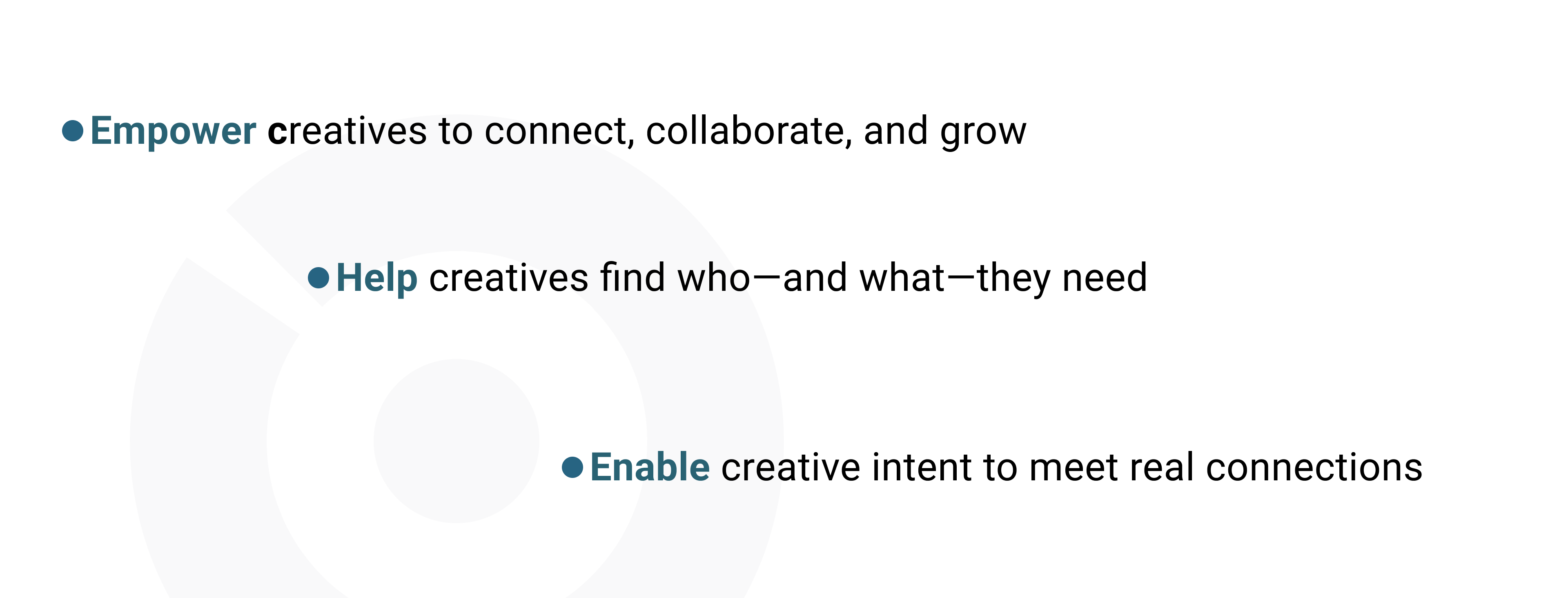
Objective
Design Thinking Framework

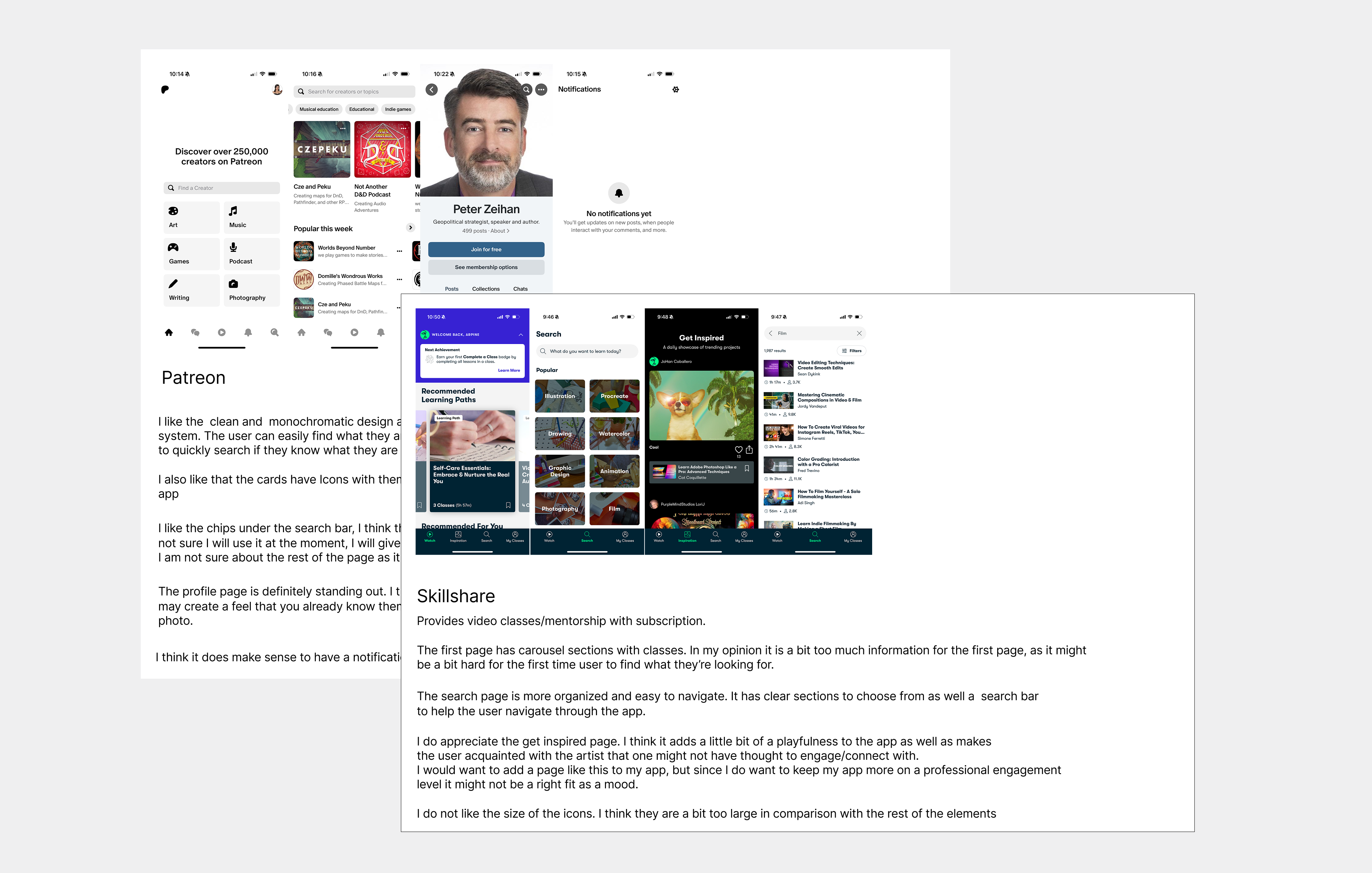
Competitive Analysis
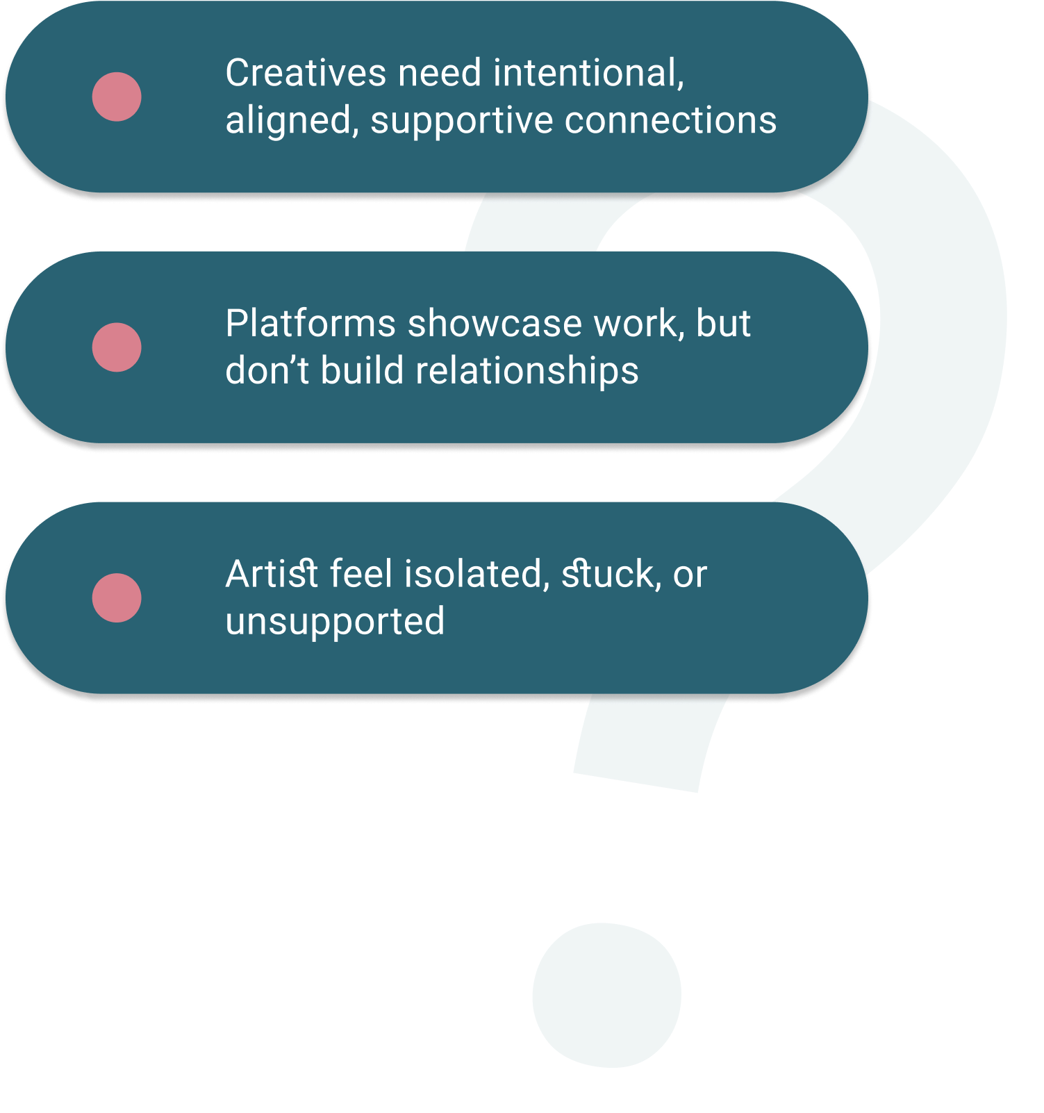
Problem
What do artists need to thrive?
In the creative world, talent alone isn’t enough — finding the right people to collaborate with, learn from, or gain support from is often what determines whether a project thrives or never gets off the ground.
Hypothesis
By creating a platform with a clear purpose and guiding users through a personalized onboarding flow, creative individuals will be more likely to form meaningful, aligned connections — leading to greater engagement, creative momentum, and a stronger sense of community.
Solution

MuseMatch will be a user-centric platform built to support creative connection. The platform will also blend AI-driven matchmaking, dynamic profiles, and structured mentorship tools to help users find collaborators, mentors, or sponsors aligned with their goals.
User
The target group of MuseMatch are individuals 16 and up — from aspiring artists to seasoned professionals. It’s a platform for anyone who believes that great things happen when creative minds connect.
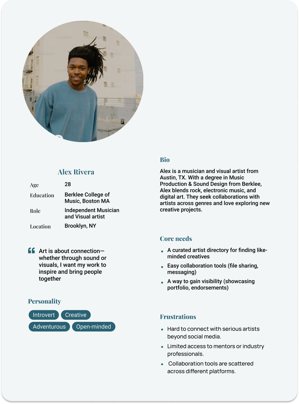
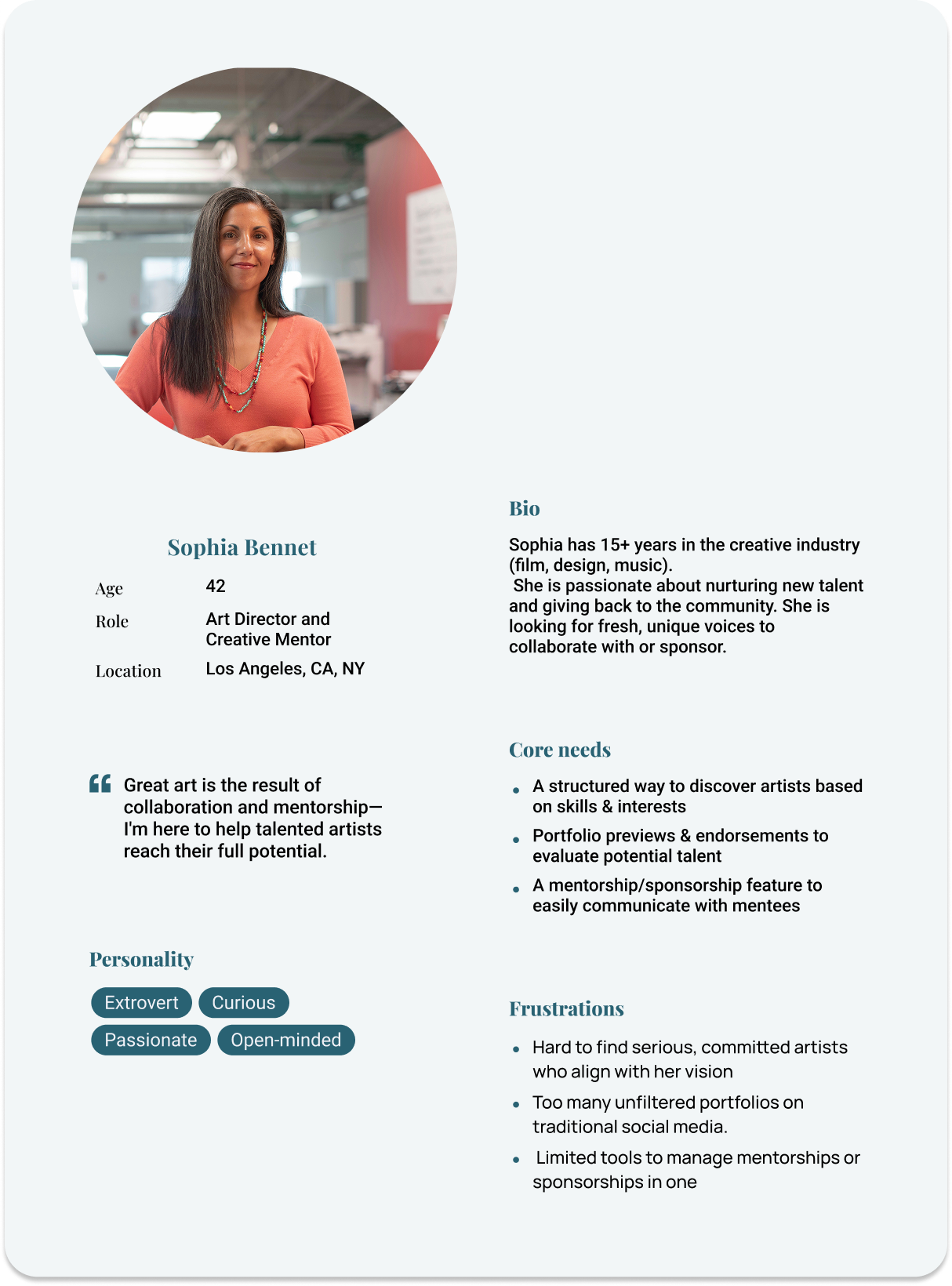
User Personas
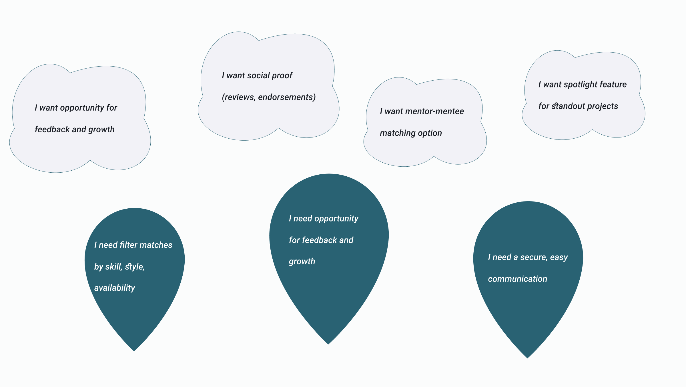
User Stories
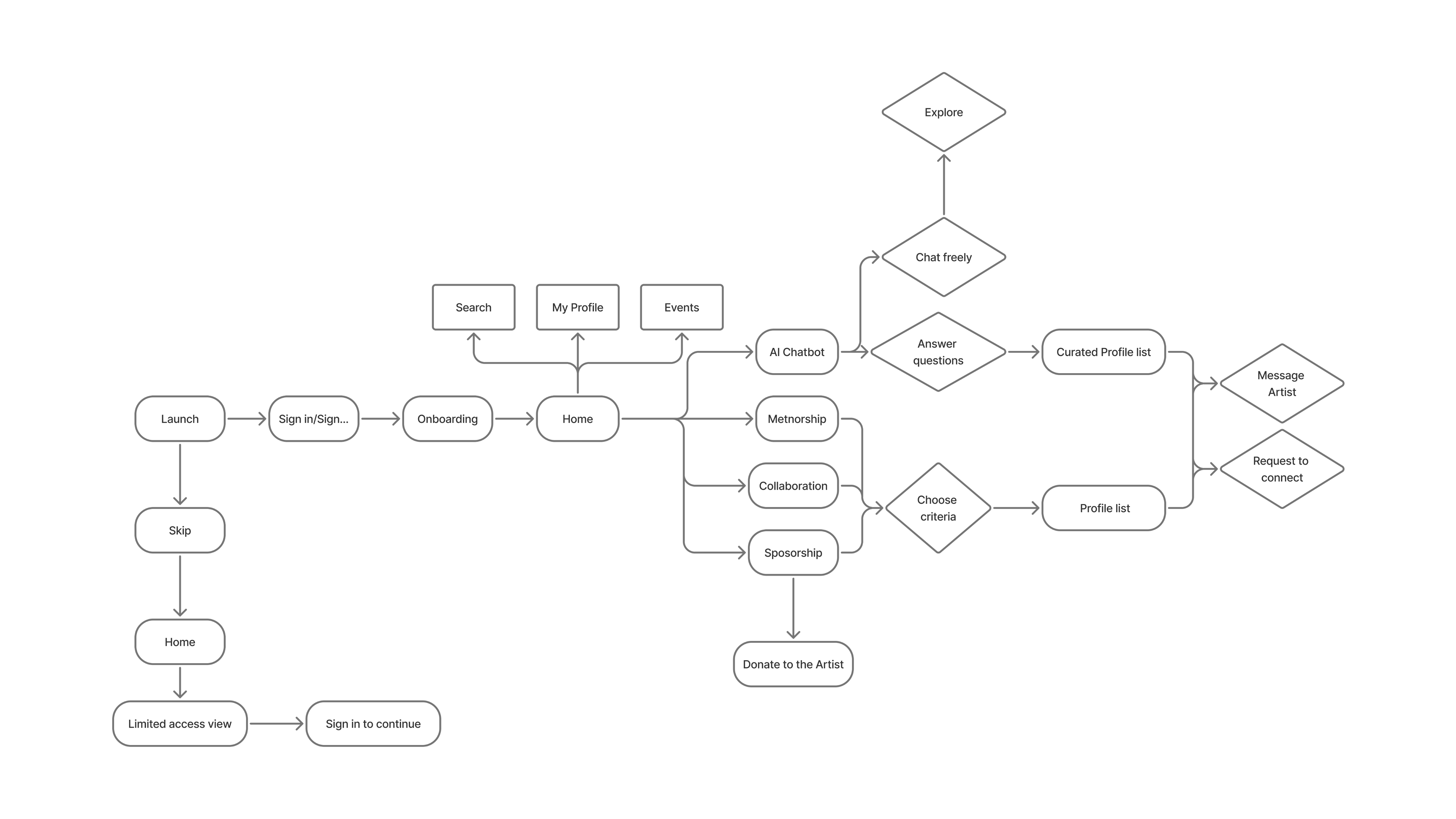
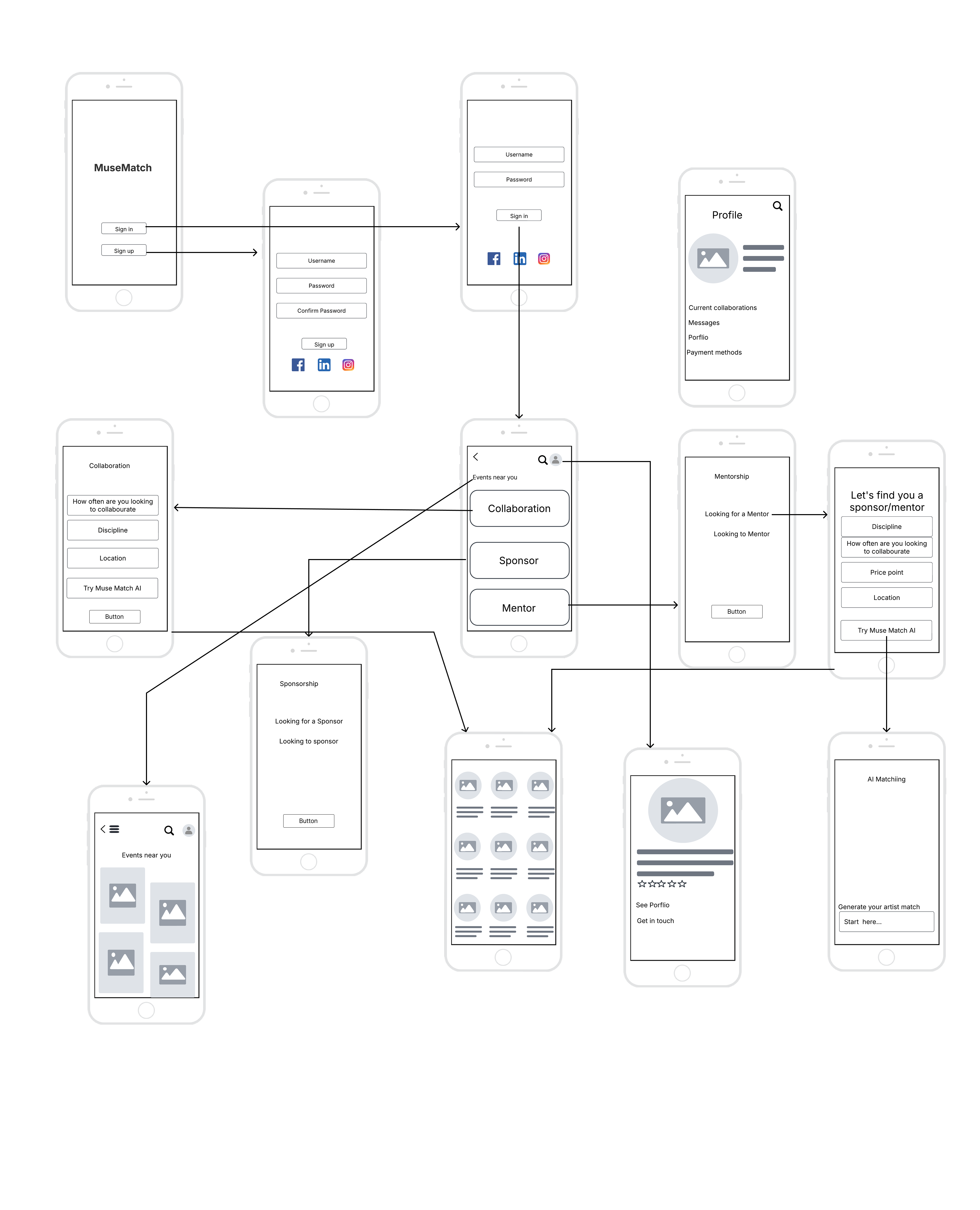
User Flow
- Users start by selecting a creative goal: collaboration, mentorship, or sponsorship.
- An AI-led, conversational flow gathers key info: field, intent, and preferences.
- Based on that, MuseMatch suggests curated matches to connect or explore.
- Prefer browsing? Users can skip the AI and explore on their own.
- The experience is intuitive, flexible, and user-centered.
User Flow Diagram
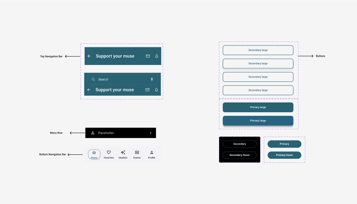
Styleguide
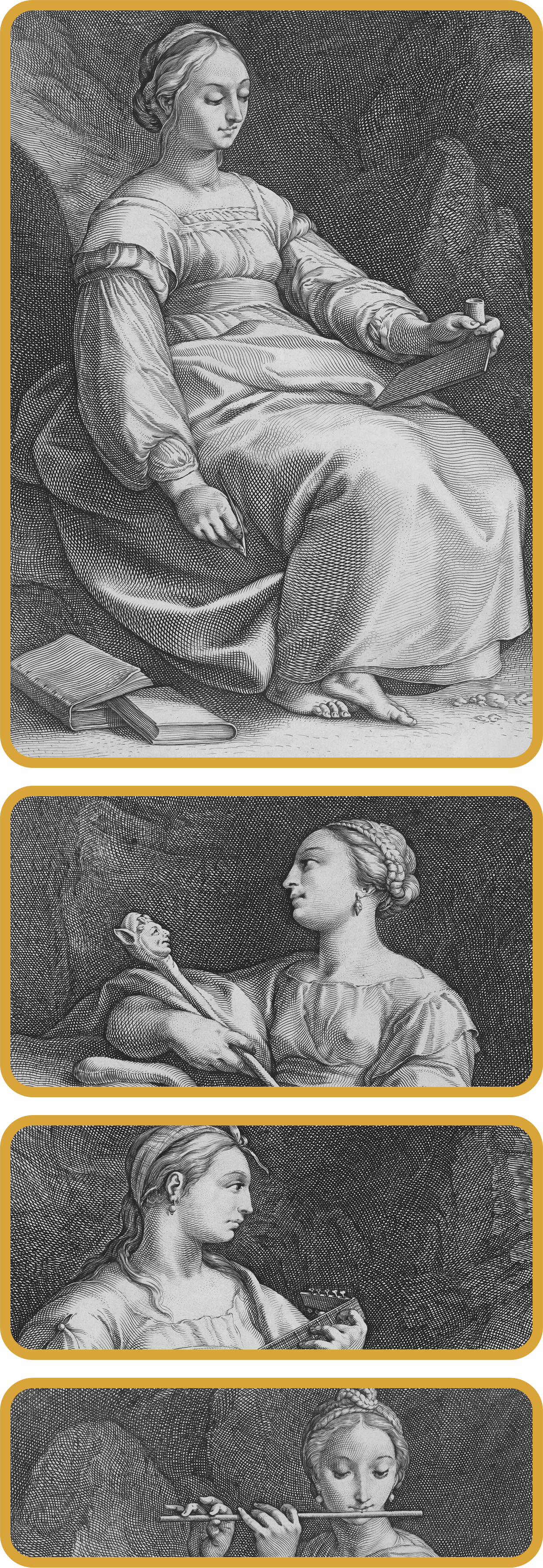
The Visual Mark
anchors the platform’s identity around creativity and connection. It serves as a symbol of the platform’s mission to help artists grow, collaborate, and find new opportunities through seamless, user-centered experiences.
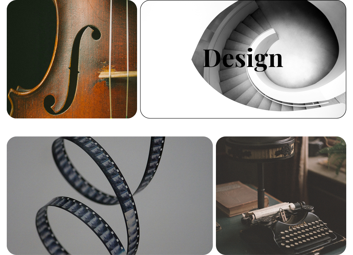
Main Navigation Card Imagery
Eye-catching, symbolic visuals are layered behind each navigation card—adding mood, texture, and a sense of atmosphere without competing with the content. Each image is carefully chosen to evoke one of the artistic “muses,” subtly guiding users as they explore different creative paths. The result is a balance of clarity and emotional tone that elevates the overall experience.
Color

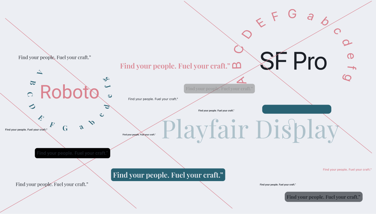
Typography
Design Evolution
Low Fidelity Wireframes
Mid Fidelity Wireframes

Usability Testing
Throughout the design process I conducted multiple rounds of informal usability testing with 7 users from various backgrounds.
Focus areas
- User flow clarity
- Visual consistency
- Feature comprehension
- Typography
- Usability across iOS and Android mockups
Feedback gathered through
- Walkthroughs
- Prototype interactions
- Follow-up conversations for qualitative insights
User Feedback

Key Findings
What Worked
- Clear and thematic visual design
- Smooth onboarding and single sign-in options
- Persistent header/footer made navigation easier
- The app concept felt meaningful to creatives
- Positive emotional tone in onboarding/chat
What needed to Improve
- All AI chat paths lead to the same generic screen
- Inconsistent navigation: notification and back buttons behave unpredictably
- Some buttons unresponsive (e.g., collaboration, music, design)
- Scrolling doesn't work on key screens (e.g., home, category views)
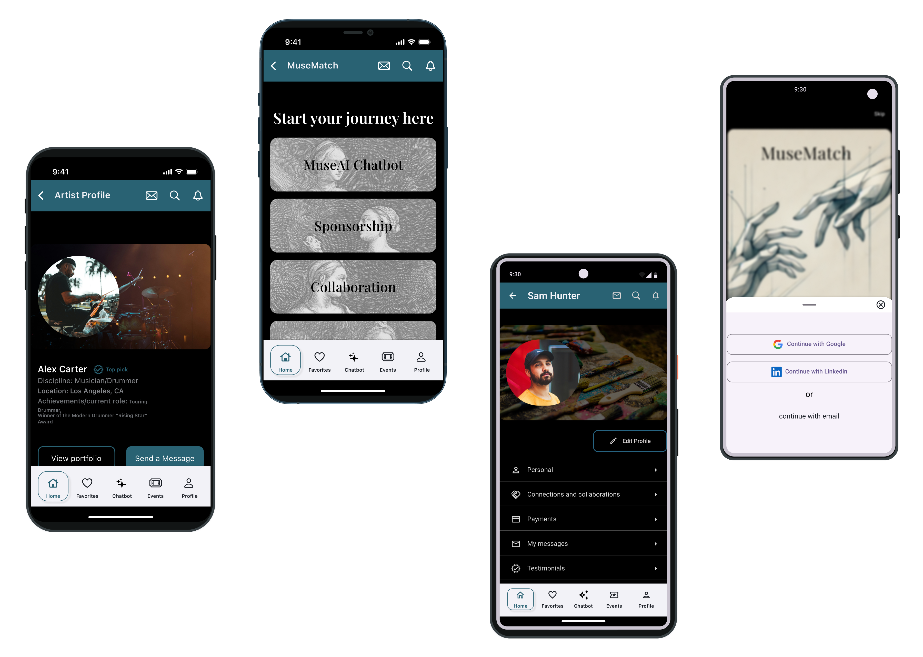
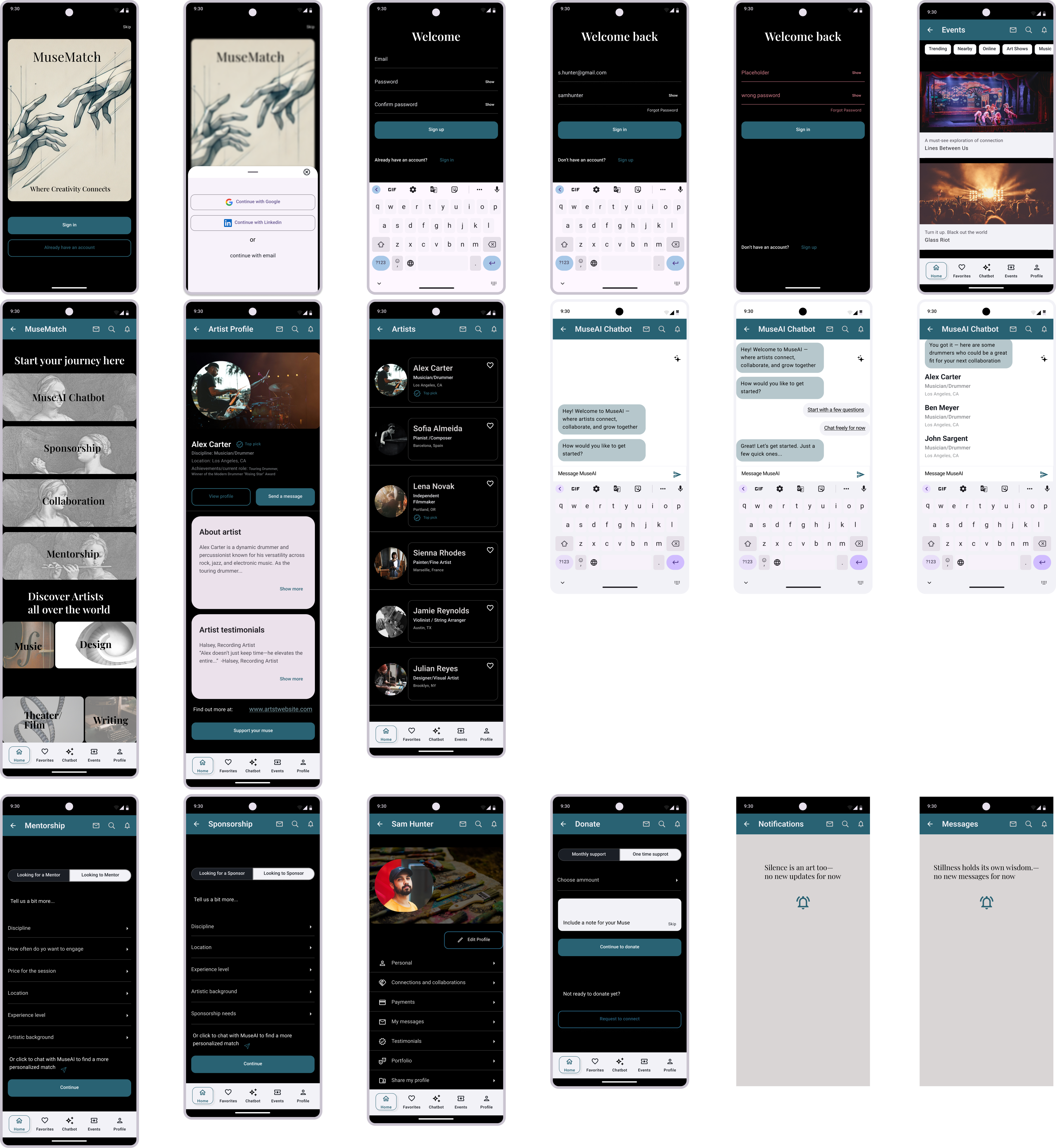
MuseMatch Screens
iOS Screens
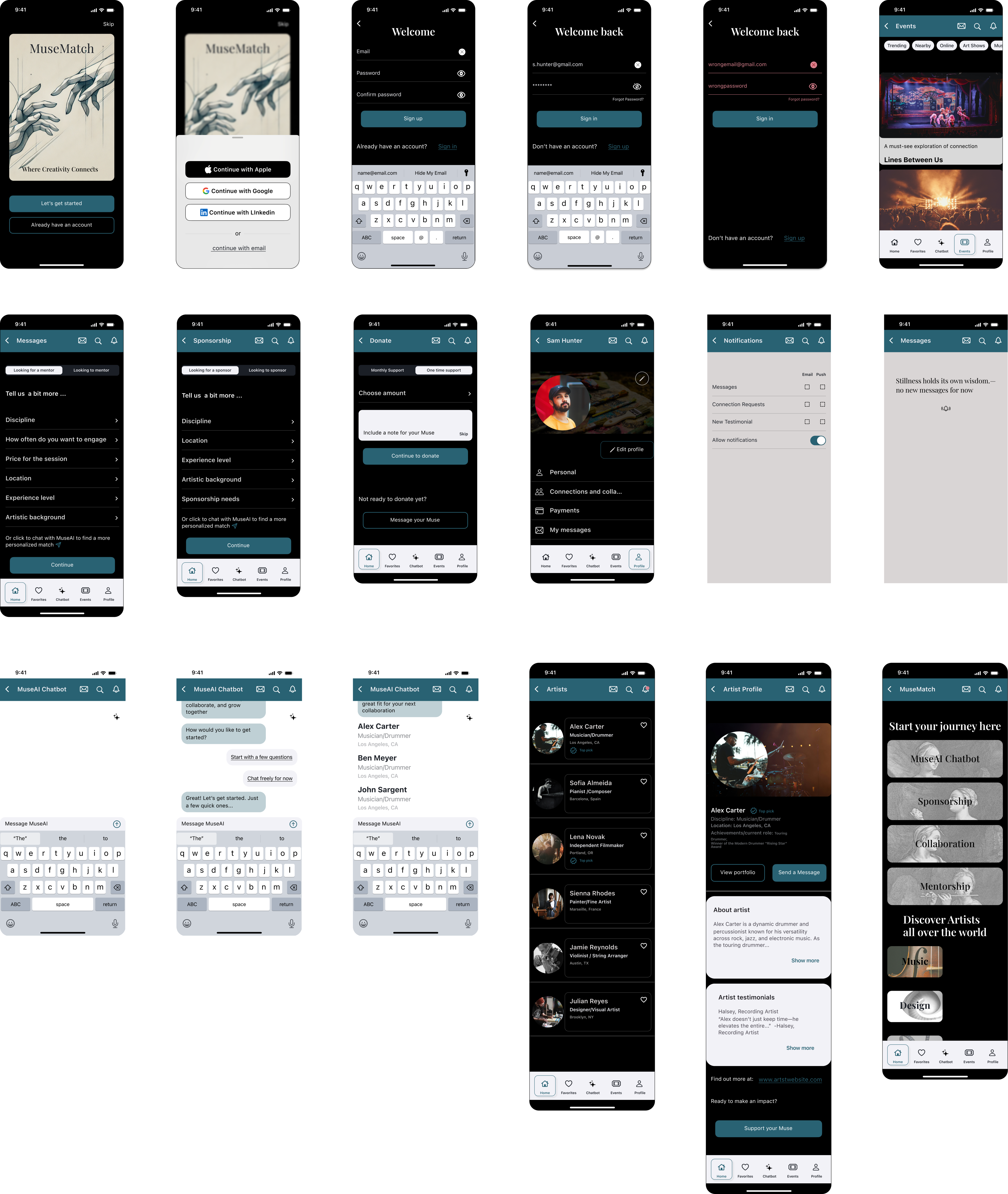
Android Screens
Prototype
Explore the interactive prototype to experience the MuseMatch flow firsthand.
View Android PrototypeView iOS Prototype
Takeaways
- Designing MuseMatch highlighted the importance of balancing creative expression with clear, user-centric structure.
- Testing and iteration showed how critical it is to create intuitive and emotionally relevant flows.
- Feedback shaped layout refinements, and deeper UX decisions around purpose, tone, and accessibility.
- Time constraints created challenges in coordinating testing, synthesizing insights, and iterating quickly without sacrificing quality.
- Ultimately, this project reinforced that great design means making intentional choices that put the user first.
- These constraints pushed me to prioritize user needs and focus on delivering clarity and emotional resonance through the core experience.
Next Steps
- Refine the prototype focusing on smoother transitions, realistic AI chat simulation, and polished user feedback states to improve the overall experience and testability.
- Plan additional testing sessions with real users to gather feedback on tone, flow, and clarity. Based on those insights iterate and improve onboarding, navigation, and feature prioritization.
- Explore the next tier of features such as: messaging center, project collaboration boards, sponsorship matching filters, AI personalization settings

Thanks for stopping by!
If you have any questions or would like to connect, please reach out via the contact form below.